1. The Apple logo has a simple bite so it won’t be mistaken for a cherry
There are many stories behind the Apple logo. A long-believed story is that the Apple logo was designed to pay tribute to Alan Turing, the legendary man who laid the foundation for modern computing and brought the concept of artificial intelligence to life. living. He was once humiliated and humiliated because he was gay and when he couldn’t stand it anymore, Alan Turing bit into a cyanide apple to commit suicide. So when the Apple logo was announced, people believed it represented the apple that Turing bit into to end his life.
But in 2009, in an interview with CreativeBits, Rob Janoff, the creator of the Apple logo, said that the reason the bite mark on the apple was purely for the sake of changing the proportions so that the small Apple logo still looks the same. an apple, not a cherry.
2. McDonald’s “M” logo
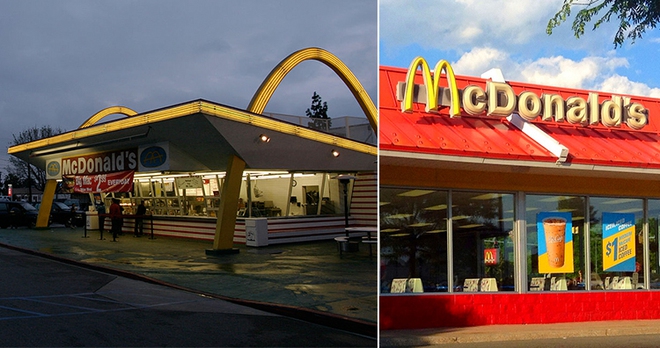
Contrary to popular belief, McDonald’s golden “M” logo doesn’t come from the McDonald’s name. In fact, it comes from the yellow architectural domes that were part of the first McDonald’s restaurant.
When brothers Richard and Maurice McDonald decided to upgrade to a new building to operate their hamburger restaurant, they hired Stanley Clark Meston to design the building. Richard made a sketch that included two semicircular domes that he thought would catch the eye of passersby. The architect then converted them into a pair of 25-foot-tall metal parabolas, illuminated by striking yellow neon lights.
When viewed from a certain angle, two golden arches converge to form a stylized version of the letter “M”. When Ray Kroc acquired the company in 1961, the distinctive design of these yellow domes was incorporated into the company’s logo.
3. Nike logo
The Nike Swoosh logo, which symbolizes the flight of the Greek goddess of victory, was designed for $35 by a student. The founder then sent her a Swoosh ring and an undisclosed amount of Nike stock as thanks.
The Nike Swoosh logo has been described by Harvard Business School professor Stephen A. Greyser as “a vibrant, vibrant corporate symbol”. The logo was designed by Carolyn Davidson while she was studying graphic design at Portland State University. Phil Knight, one of the founders of Nike at the time, heard that Carolyn was looking to earn extra money to take oil painting classes. He offers to pay her with some part-time work for his company. He agrees to pay her $2 per hour if he accepts the invitation.
Carolyn worked long hours, designing many logos for the company, but in the end the logo we know as Swoosh today was chosen. Carolyn was paid $35 when she worked 17.5 hours on the logo design although she now claims she put in more time than that!
In September 1983, Phil Knight gave Carolyn a gold Swoosh ring set with a diamond. He even gave her some undisclosed Nike stock to show his gratitude.
4. Ferrari’s prancing horse logo
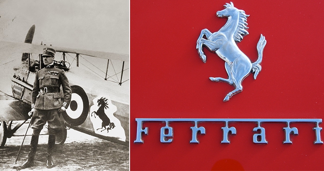
Ferrari’s prancing horse logo was originally adorned on the plane of Count Francesco Baracca, Italy’s top fighter in World War I. After Francesco was shot down, his mother told Enzo Ferrari, “Ferrari, let’s go. put my son’s prancing horse in his carriage. It will bring you luck.”
Car enthusiasts, racing fans have engraved in their minds the symbol of Ferrari’s prancing horse. We all know that the famous logo featuring a galloping horse is black on a bright yellow background with the letters “S” and “F” engraved on it which stands for Scuderia Ferrari.
What some of us may not know is that the prancing horse logo was once the emblem of the legendary Count Francesco Baracca of the Italian Air Force. He lost his life in World War I after completing 34 victorious engagements and many other team victories. He drew the symbol of a prancing horse on his fighter plane.
When Enzo Ferrari met Francesco’s parents, his mother suggested that Enzo should use the prancing horse symbol on his car and that it would bring good luck. It was not until 12 years later that Enzo Ferrari used the emblem on the Scuderia at the SPA 24 Hours in 1932. Ferrari won the race. Since then, the prancing horse has been kept as black as on Francesco’s plane. Ferrari only added a yellow background to represent the color of his birthplace, Modena.
Ferrari is not the only company to use the prancing horse as part of their logo. Fabio Taglioni also used it on his Ducati motorcycles. But as Ferrari’s reputation grew, Ducati dropped the prancing horse logo. Now the prancing horse logo is completely Ferrari trademark.
5. Logo of Bluetooth
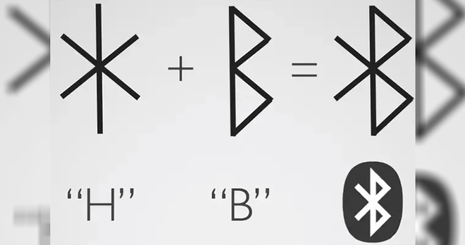
Ericsson named their revolutionary technology “Bluetooth” after Harald Bluetooth, who ruled Denmark as their king between 958 and 986 AD.
During his rule, he introduced Christianity to Denmark and Norway, and contributed to the unification of the various Danish tribes under one kingdom. This meaning was used when naming the wireless technology Bluetooth because like the king of unifying people, this technology allows different devices to be able to connect with each other and help communicate between them. easier.
The logo is designed using a binding command. A rune binding is essentially a combination of runes or letters used to write Germanic languages before Latin letters were adopted. In the logo, two lines Younger Futhark, commonly known as Scandinavian Runes, represent the merged king’s initials – ᚼ (Hagall) and ᛒ (Bjarkan).
.
