There was no Apple logo printed on the device when Steve Wozniak created the Apple-I in 1975, or when Steve Jobs sold the device in July 1976. But when Apple was officially founded on April 1, 1976, the company had a logo of its own.
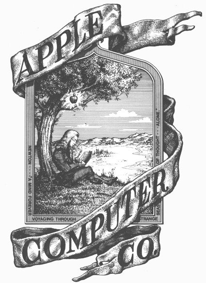
This logo was designed by Apple’s third founder, Ron Wayne, but its lifespan is as short as his time in office. Wayne left Apple just days after the company was founded, and within a year, his original logo was also replaced.
This logo seems to exist in a completely different world than the simple, monochrome apple logo we see today. It looks like a woodcut from some Victorian novel, and the font around the logo itself isn’t very modern.

If you look closely, you will see the words “Newton – A mind forever voyaging through strange seas of though alone“, taken from the novel “The Prelude” written by William Wordsworth in 1850 – 126 years before it was borrowed by Wayne for inclusion in the logo – refers to the man in the center of the logo, sitting in a sitting position. very similar to the human figure that Amazon later used as the logo for the Kindle.
Logo 6 colors, but not meaningful as you know today
Wayne’s hand-drawn logo was replaced in 1977 with a work by designer Rob Janoff.
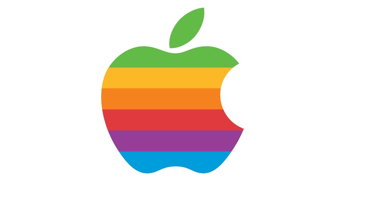
It’s the apple-shaped logo that you’re seeing at the moment, but not in monochrome, but filled with the famous six color bands.
“It’s really very simple” – Janoff said in an interview.I bought a few apples, put them in a basket, and painted them for a week or more in an attempt to simplify the logo’s shape.“
He said that the entire design process, from concept to final product, took about two weeks, and his plan was to have a logo before the launch of the Apple II computer. in April 1977.

“The company does not say much when assigning logo design, except for the request ‘don’t make it cute’‘ continued Janoff.But I do know the merits of Apple computers (at the time), and one of the biggest advantages was the ability to render colors.“
“To me, they look like colored bars on the screen, and have been turned into stripes in the logo. The order of those strips, I’m sorry, doesn’t make any sense except that I like the layout” – he said.
Steve Jobs and the 6-color logo
Some sources claim that, unlike the final finished logo version we’re familiar with, Janoff’s design features darker bands of color at the top, and lightens as it goes down. And it was Steve Jobs who wanted to reverse that order.
Janoff himself said of his original version, “of course, the green stripe should be at the top, where the leaves are (of the apple)“
Although it is not clear where former Apple head Jean-Louis Gassee talked about this logo, there are many articles repeatedly quoting him that the 6-color logo is very suitable for Apple.
“One of the great mysteries to me is the company’s logo, a symbol of lust and knowledge, partially bitten, with bands of rainbow colors in a chaotic order.” – he said.
“You couldn’t dream of a more appropriate logo: lust, knowledge, hope, and chaos“- he continued.
Pretty sure it was Jobs who wanted to keep an element of Janoff’s design, even though it made printing the logo much more expensive. Back then, it was common to print in 4 colors, so having 6 is obviously more expensive – but that’s not the point.
The problem was that Jobs was adamant that he wouldn’t let lines separate those six colors. Straight lines will make printing easier, colors will not overlap, because they allow errors in the printing process.
Jobs didn’t want straight lines, so the printing process had to be even more precise, leading to further costs.
However, the early Apple logo was sometimes still printed in a single color, often with the company’s full name and address included. In those cases, the phrase “apple computer inc” is in lowercase, with the word “a” is located right in the hole of the apple.
Even so, the new 6-color version is honored to appear in every advertisement – and is included in Macintosh computers as well.
Later, Michael Scott, Apple CEO from 1977 to 1981, referred to this apple symbol as “Most expensive logo ever designed“
Long live
It was Steve Jobs who wanted the 6-color apple logo, and it was he who wanted to replace it when he returned to power at the company in the 1990s. Janoff’s 6-color logo existed from 1977 to 1998, a total of 21 years. .
However, a year before it was discontinued, the familiar apple logo was changed to a completely white version and appeared on the case of the PowerBook G3. The box containing the device has both a completely white and a completely black logo.

In 1998, the all-black version began to become the official Apple logo.
Apart from the color change, the rest of the logo remains the same and has never been changed since.
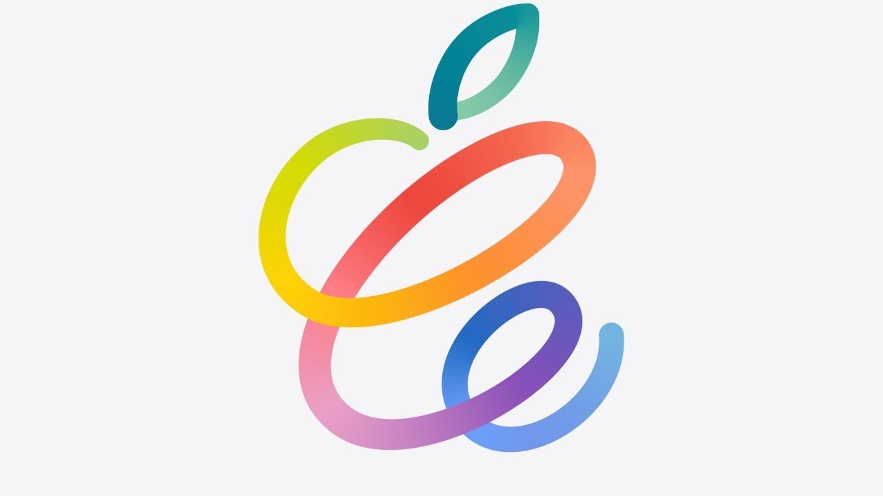
In recent years, Apple has slightly modified this logo for use in its event invitations, but anyone who looks at it knows what the logo actually looks like!

From 1998 to the present, there have been many other versions of the Apple logo, but each version is different only in color and texture.
Apple logo monochrome
In 1998, Apple briefly changed its logo to celebrate the launch of the iMac. The logo color is converted to a translucent blue (Bondi Blue), similar to the early iMacs, and rendered in a gentle 3D style.
Rather than implying the Apple II’s ability to reproduce colors, this first logo redesign since the 1970s literally represents the iMac’s diversity of colors.
Similarly, when the iMac and iBook came out in different colors, the Apple logo on them changed color to match. The PowerBook retains the white, backlit, logo on the case.
But apart from the brief shining moment on stage at the product launch, the blue version of the logo (Bondi Blue) was not chosen by Apple as the official logo for a long time.
Instead, the all-black version continues to dominate, but only on the surface of the products on which it is printed. Mac OS 8 continues to use the rainbow-colored logo on the screen, in the Apple menu, and in the “About This Computer” section.
That changed when OS X was introduced in 2001, when the Apple menu adopted the new operating system’s Aqua-branded look. It’s like the iMac’s Bondi Blue logo, with a 3D effect.
But at the same time, some apps, like iTunes, use the completely black Apple logo.
At this point, ie the early 2000s, the color of the Apple logo was not highly consistent. Its shape may not change, but the color is quite variable.
Until 2007, when the iPhone was born.
Still compatible with iPhone
Then, in 2013, iOS underwent an interface overhaul, all 3D effects were removed, and so was the 3D logo.
As iOS moved to a flatter design, the logo obviously changed. However, it does not completely revert to a pure black color.
Instead, the Apple logo tends to be silver gray. Today, it can be this color, or it can be completely black, depending on the usage situation.

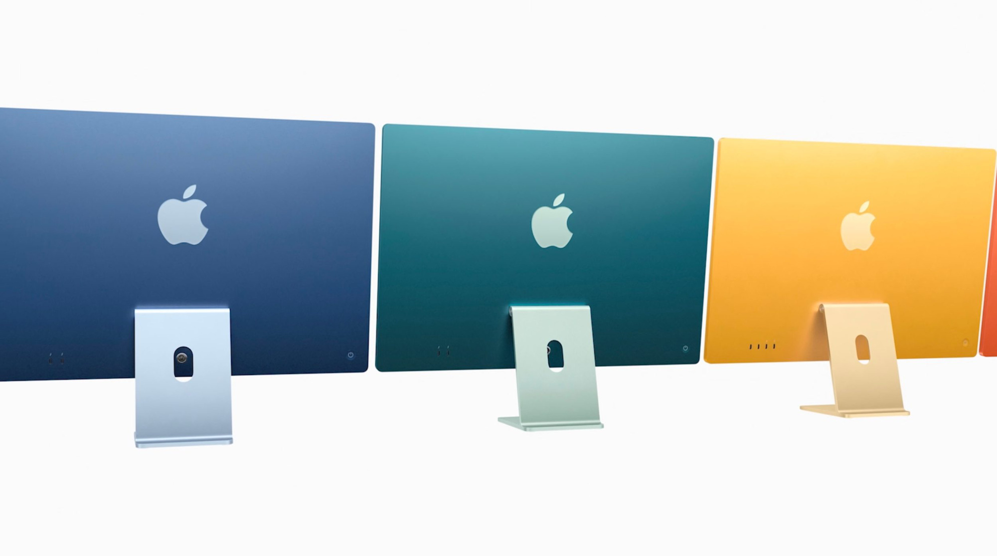
And every now and then, Apple looks back to the past with its six-color logo. Only the 6 colors this time around are not like the 6 colors of the past – they match the colors of the 24-inch iMac.
Logos exist for nearly half a century
When asked about his impression of the original work that has changed little since 1977, Janoff said: “Although the logo has changed over the years, it still has the basic shape and idea that I designed it for. I feel extremely fortunate to agree with Steve Jobs on this issue“
“It’s like watching your kids grow up and succeed. I’m so proud of my kids – and the logo too“- he continued.
Reference: AppleInsider
The Prime Minister of Canada uses an HP laptop with the Apple logo to hold an online meeting
